How to Make Your Stream Deck Pretty
The Problem
The Stream Deck is a powerful tool and with a little TLC you can have an awesome look to go with it. For a lot of needs, the Stream Deck Key Creator tool is plenty. If all you need is a single icon or even a single page of icons, the Key Creator might be enough to satisfy your needs. The Key Creator tool falls short for me in two specific ways:
- The image editing tools are not great. Sometimes I need to touch up the icon that I want to use in Affinity Designer to get it to look a certain way before adding it into the Key Creator.
- I like using a “wallpaper style” setup where the Stream Deck is made to look like it has a consistent wallpaper across all the keys which is on a layer behind the actual icon. The Key Creator supports this, but once you get to multiple profiles or folders (which I do because I like keeping all my macros organized), keeping them up to date is a pain.
The Solution
Since most of the time I was opening up Affinity Design to touch up my icons anyway, I figured I would use it to create the entire setup. This way I could have my powerful image editing tools in the same place I created all my keys and I could save the entire file which could easily be reopened for editing.
Note: Using this method will obviously require that you own Affinity Designer and have some experience with it and/or other image editing software like Adobe Photoshop or Illustrator.
To this end, I created a template which you can download. I’ll be going over my process in this post so feel free to download the template and follow along.
The Process
I never edit the template directly unless I need to make template-related changes, so let’s make a copy of it and work on that. The first time you open up the template you’ll see the following:

- The document.
- The layer for the borders. This is simply aesthetic so you can get a sense of how the icons would look with dark borders in between them. None of this will be rendered out.
- The embedded document layer for the background.
- The layer group for the actual icons (which are called slices here because that’s the terminology Affinity uses for exporting cropped sections of a document).
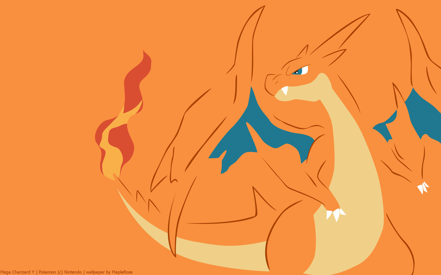
I start by choosing a background image. Sometimes I want something fancy and I’ll make it myself, but today I’m going to be using a wallpaper made by the amazing MapleRose. It’s a Mega Charizard-Y wallpaper. I like Pokémon. Sue me.
I start by double-clicking on the little thumbnail of the background layer in order to edit it. You gotta click right on the little thumbnail otherwise you’ll edit the label of the layer instead of opening up the embedded document.

Once the embedded document is open, modify it however you like. There’s a placeholder rectangle there just so it has some color when you open up the template, but feel free to change it however you like. I’ll be dropping the Charizard wallpaper in here. It’ll overflow a little bit but that’s okay, it’ll be cropped appropriately in the icon layout.
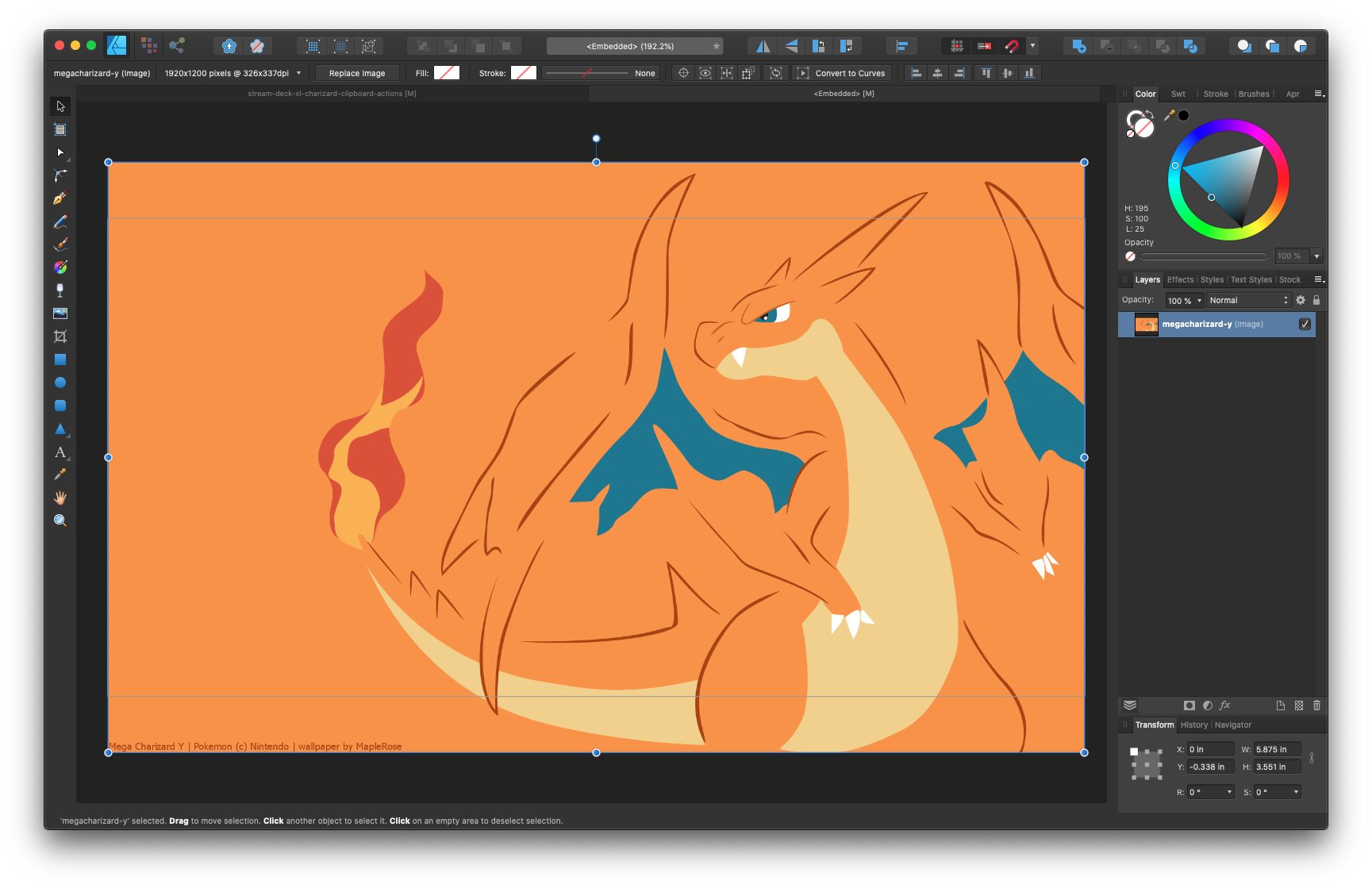
Save the embedded document and close the tab that it was opened in. Returning to the original document you’ll see something like this:
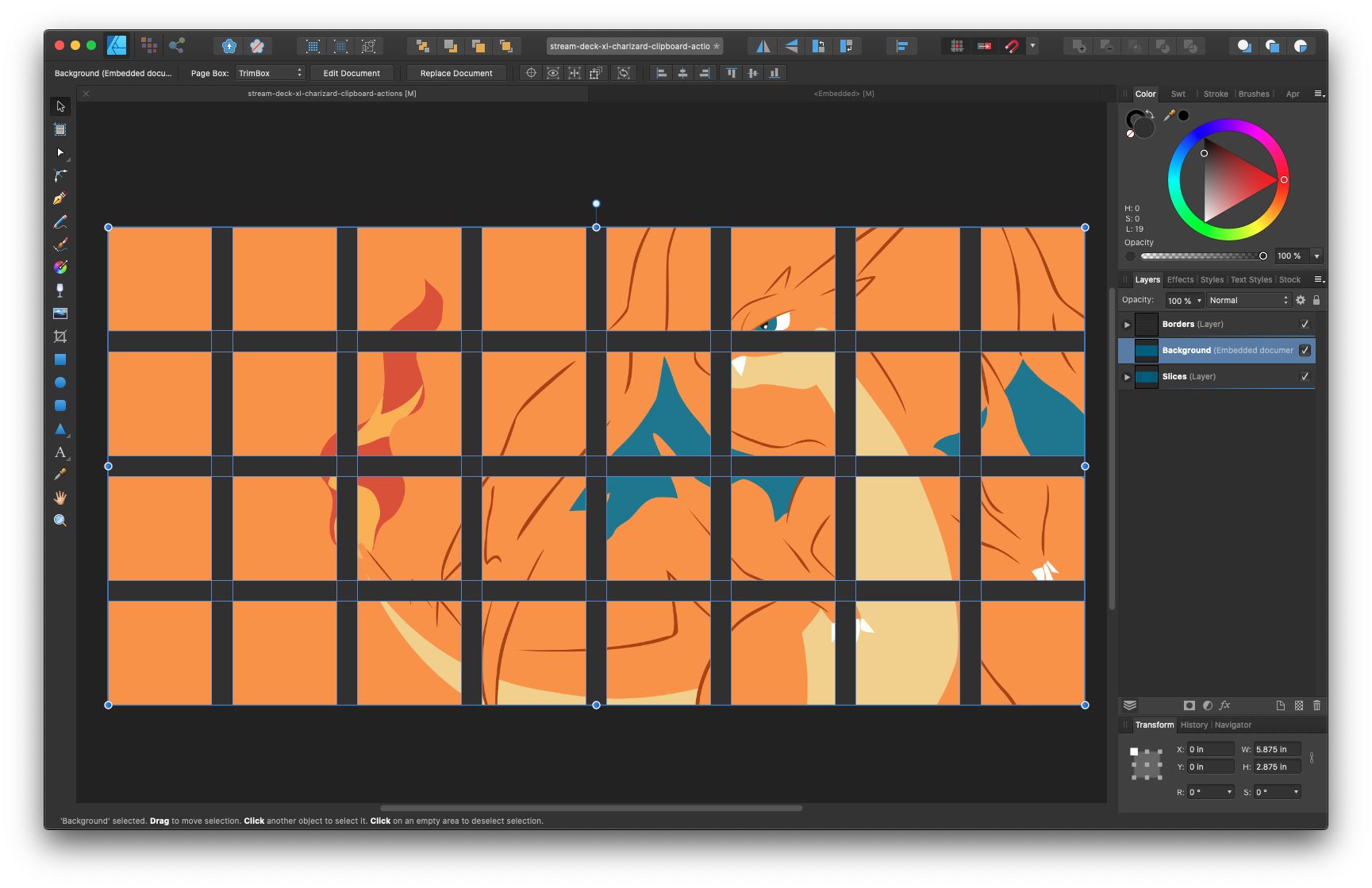
Not half bad! With the background in place, we’re ready to start editing icons! I’m going to be throwing in some media icons but feel free to use whatever you need. The icons I grabbed were open source ones designed by Freepik from www.flaticon.com.
We’ll start with a volume down icon all the way on the bottom left. That’s the layer labeled “slice-1-1”.
Note: The icons are laid out in a coordinate system with the first number indicating the horizontal position, and the second number indicating the vertical position. So the bottom left icon is “slice-1-1” while the top right is “slice-8-4”.
Let’s drop our icon (in my case an SVG file, but any old image works the same) into that layer and adjust its size to fit into the little square where it belongs. Here’s the result:
![]()
Looks good! Let’s add in the rest to the nearby icon layers. From left to right, top to bottom, we’ll fill in slice-1-1, slice-2-1, slice-3-1, slice-1-2, slice-2-2, and slice-3-2. Here’s what that looks like:
![]()
If at this point you’re seeing something different, it’s important to pay attention to where my icons are in the layer panel to the right.

You can think of each slice a little window into the canvas that only shows what’s in its layer. That’s why it’s crucially important to place images in the correct layers in the template. Note in the image above how the volume up icon is placed inside the slice-3-1 layer and just above the background embedded document within that layer. That’s what you’re looking for: inside the slice, above the background.
Now that we have all the icons we want. Let’s head over to what Affinity calls the “Export Persona” by clicking on its button on the top left of the window.
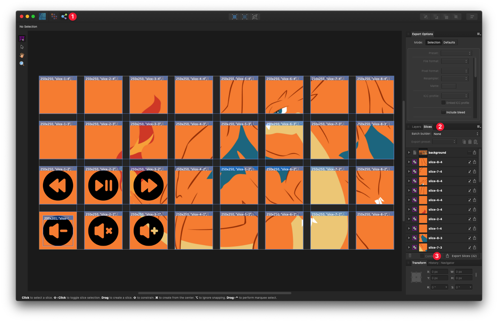
- Click on the Export Persona button.
- Click on the Slices tab on the top of the right panel.
- Click on “Export Slices (32)” on the bottom of that panel.
Affinity will ask you where you want to save your icons and once they’re saved, they’re ready to be used! Keeping in mind the coordinate system I mentioned earlier, go ahead and drop them into your Stream Deck profile.
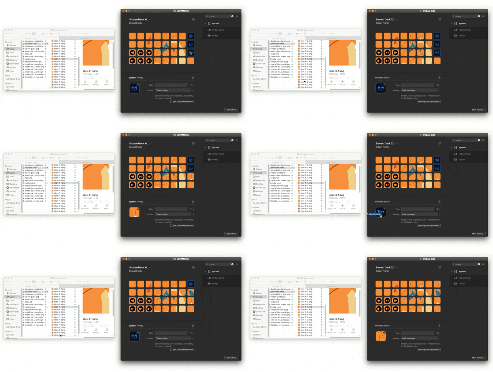
As a side note, the Stream Deck does require that you have a functional button before you can assign it an image, so I just gave my entire Stream Deck empty “Hotkey” buttons.
The Result
Let’s take a look at the end result!
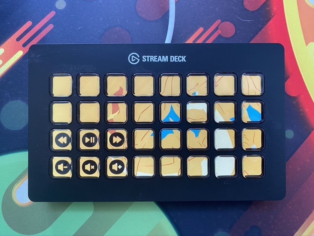
Not too shabby!
